Tech Giant Invests Huge Money to Build a Computer Out of Science Fiction
The tech giant says it is ready to begin planning a quantum computer, a powerful cpu machine that relies on subatomic particles instead of transistors.

By Robin Darnell
The tech giant says it is ready to begin planning a quantum computer, a powerful cpu machine that relies on subatomic particles instead of transistors.
By Robin Darnell
This giant of a whale says it is ready to begin planning a new swim later this afternoon. A powerful mammal that relies on fish and plankton instead of hamburgers.
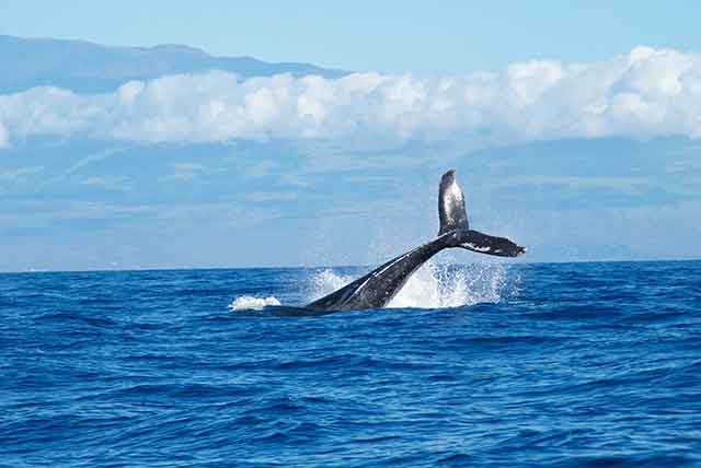
By Katherine Grant
Archaeologists have found more than 40 tons of vinyl records, some more than a five years old, shedding light on early hipster trends.
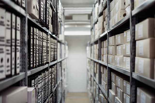
By Imelda Clancy
<section class="mw7 center">
  <h2 class="athelas ph3 ph0-l">News</h2>
  <article class="pv4 bt bb b--black-10 ph3 ph0-l">
    <div class="flex flex-column flex-row-ns">
      <div class="w-100 w-60-ns pr3-ns order-2 order-1-ns">
        <h1 class="f3 athelas mt0 lh-title">Tech Giant Invests Huge Money to Build a Computer Out of Science Fiction</h1>
        <p class="f5 f4-l lh-copy athelas">
          The tech giant says it is ready to begin planning a quantum
          computer, a powerful cpu machine that relies on subatomic particles instead
          of transistors.
        </p>
      </div>
      <div class="pl3-ns order-1 order-2-ns mb4 mb0-ns w-100 w-40-ns">
        <img src="http://mrmrs.github.io/photos/cpu.jpg" class="db" alt="Photo of a dimly lit room with a computer interface terminal.">
      </div>
    </div>
    <p class="f6 lh-copy gray mv0">By <span class="ttu">Robin Darnell</span></p>
    <time class="f6 db gray">Nov. 21, 2016</time>
  </article>
  <article class="pv4 bb b--black-10 ph3 ph0-l">
    <div class="flex flex-column flex-row-ns">
      <div class="w-100 w-60-ns pr3-ns order-2 order-1-ns">
        <h1 class="f3 athelas mt0 lh-title">A whale takes up residence in a large body of water</h1>
        <p class="f5 f4-l lh-copy athelas">
          This giant of a whale says it is ready to begin planning a new
          swim later this afternoon. A powerful mammal that relies on fish and plankton instead
          of hamburgers.
        </p>
      </div>
      <div class="pl3-ns order-1 order-2-ns mb4 mb0-ns w-100 w-40-ns">
        <img src="http://mrmrs.github.io/photos/whale.jpg" class="db" alt="Photo of a whale's tale coming crashing out of the water.">
      </div>
    </div>
    <p class="f6 lh-copy gray mv0">By <span class="ttu">Katherine Grant</span></p>
    <time class="f6 db gray">Nov. 19, 2016</time>
  </article>
  <article class="pv4 bb b--black-10 ph3 ph0-l">
    <div class="flex flex-column flex-row-ns">
      <div class="w-100 w-60-ns pr3-ns order-2 order-1-ns">
        <h1 class="f3 athelas mt0 lh-title">
          ‘We Couldn’t Believe Our Eyes’: A Lost World of Vinyl Is Found
        </h1>
        <p class="f5 f4-l lh-copy athelas">
          Archaeologists have found more than 40 tons of vinyl records,
          some more than a five years old, shedding light on early hipster
          trends.
        </p>
      </div>
      <div class="pl3-ns order-1 order-2-ns mb4 mb0-ns w-100 w-40-ns">
        <img src="http://mrmrs.github.io/photos/warehouse.jpg" class="db" alt="Photo of a warehouse with stacked shelves.">
      </div>
    </div>
    <p class="f6 lh-copy gray mv0">By <span class="ttu">Imelda Clancy</span></p>
    <time class="f6 db gray">Nov. 19, 2016</time>
  </article>
</section>
.bt {
    border-top-style: solid;
    border-top-width: 1px;
}

.bb {
    border-bottom-style: solid;
    border-bottom-width: 1px;
}

.b--black-10 {
    border-color: rgba(0, 0, 0, .1);
}

.db {
    display: block;
}

.flex {
    display: flex;
}

.flex-column {
    flex-direction: column;
}

.order-1 {
    order: 1;
}

.order-2 {
    order: 2;
}

.athelas {
    font-family: athelas, georgia, serif;
}

.lh-title {
    line-height: 1.25;
}

.lh-copy {
    line-height: 1.5;
}

.mw7 {
    max-width: 48rem;
}

.w-100 {
    width: 100%;
}

.gray {
    color: #777;
}

.pv4 {
    padding-top: 2rem;
    padding-bottom: 2rem;
}

.ph3 {
    padding-left: 1rem;
    padding-right: 1rem;
}

.mb4 {
    margin-bottom: 2rem;
}

.mt0 {
    margin-top: 0;
}

.mv0 {
    margin-top: 0;
    margin-bottom: 0;
}

.ttu {
    text-transform: uppercase;
}

.f3 {
    font-size: 1.5rem;
}

.f5 {
    font-size: 1rem;
}

.f6 {
    font-size: .875rem;
}

.center {
    margin-right: auto;
    margin-left: auto;
}

@media screen and (min-width: 30em) {
    .flex-row-ns {
        flex-direction: row;
    }

    .order-1-ns {
        order: 1;
    }

    .order-2-ns {
        order: 2;
    }

    .w-40-ns {
        width: 40%;
    }

    .w-60-ns {
        width: 60%;
    }

    .pl3-ns {
        padding-left: 1rem;
    }

    .pr3-ns {
        padding-right: 1rem;
    }

    .mb0-ns {
        margin-bottom: 0;
    }
}

@media screen and (min-width: 60em) {
    .ph0-l {
        padding-left: 0;
        padding-right: 0;
    }

    .f4-l {
        font-size: 1.25rem;
    }
}
npm i --save tachyons-borders tachyons-border-colors tachyons-display tachyons-flexbox tachyons-font-family tachyons-line-height tachyons-max-widths tachyons-widths tachyons-skins tachyons-spacing tachyons-text-transform tachyons-type-scale tachyons-utilities